— KTR Law Firm
Simplified navigation, scalable structure, and a clean visual identity to help KTR Law build credibility and guide users across 8+ legal services.
LEGAL
LAW FIRM
RESEARCH
UX AUDIT
INFORMATION ARCHITECTURE
VISUALS DESIGN
DEVELOPER HANDOFF

Numbers don't lie
❖
The result
❖
Cost reduction through optimized handoffs.
DEFINING THE PROBLEM
KTR has been using the same website for the last couple of years. Whenever they wanted to add additional information or pages, they just added them to the website, making the entire project appearance cluttery. Each component was designed differently, thus communication was ambiguous.
Less emphasis on main CTA and other critical information.
Poor accessibility, usability and responsiveness.
Cluttered layout and confusing navigation.
Research
✢
Understanding domain
✢
Research
✢
Understanding domain
✢
RESEARCH FINDINGS
I conducted research to understand how people seek legal services and what information they expect from law firm websites. Using quantitative data from surveys and online sources, I redesigned KTR’s website to deliver a fresh, user-centered visual experience.
81% said a law firm’s years of experience was important.
76% considered pricing and fee structure a key factor.
66% said past case results would influence their choice.
<7% ranked social media presence among their top 5 factors.
15% considered awards and memberships important.
What information on a law firm’s website matters most to consumers?

According to a survey by iLawyerMarketing
57% indicated that they would use a smartphone (iPhone, Samsung Galaxy, etc.) if searching online for a lawyer.
31% of participants said they would use only use a smartphone.
26% said they would use a combination of smartphone and laptop/desktop computer.
25% of those polled said they would only use a desktop/laptop computer.
The key takeaway: prioritize the mobile experience. A poorly optimized site leads to higher drop-off rates and fewer clients.
What device do people use to research lawyers online?
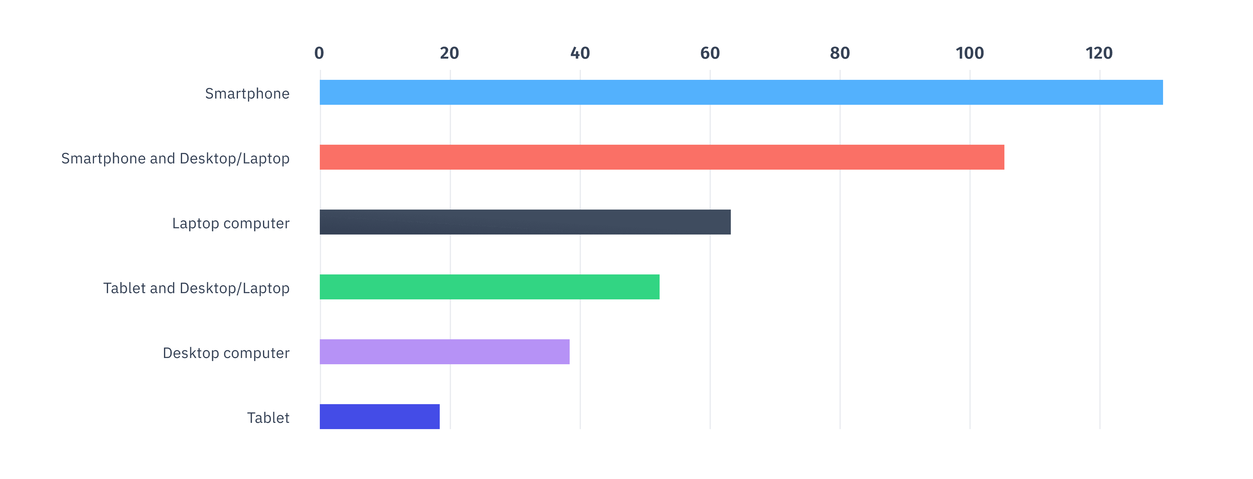
According to a survey by iLawyerMarketing
Designing phase
✢
Building as a brand
✢
VISUAL LANGUAGE
Establishing the Visual Foundation
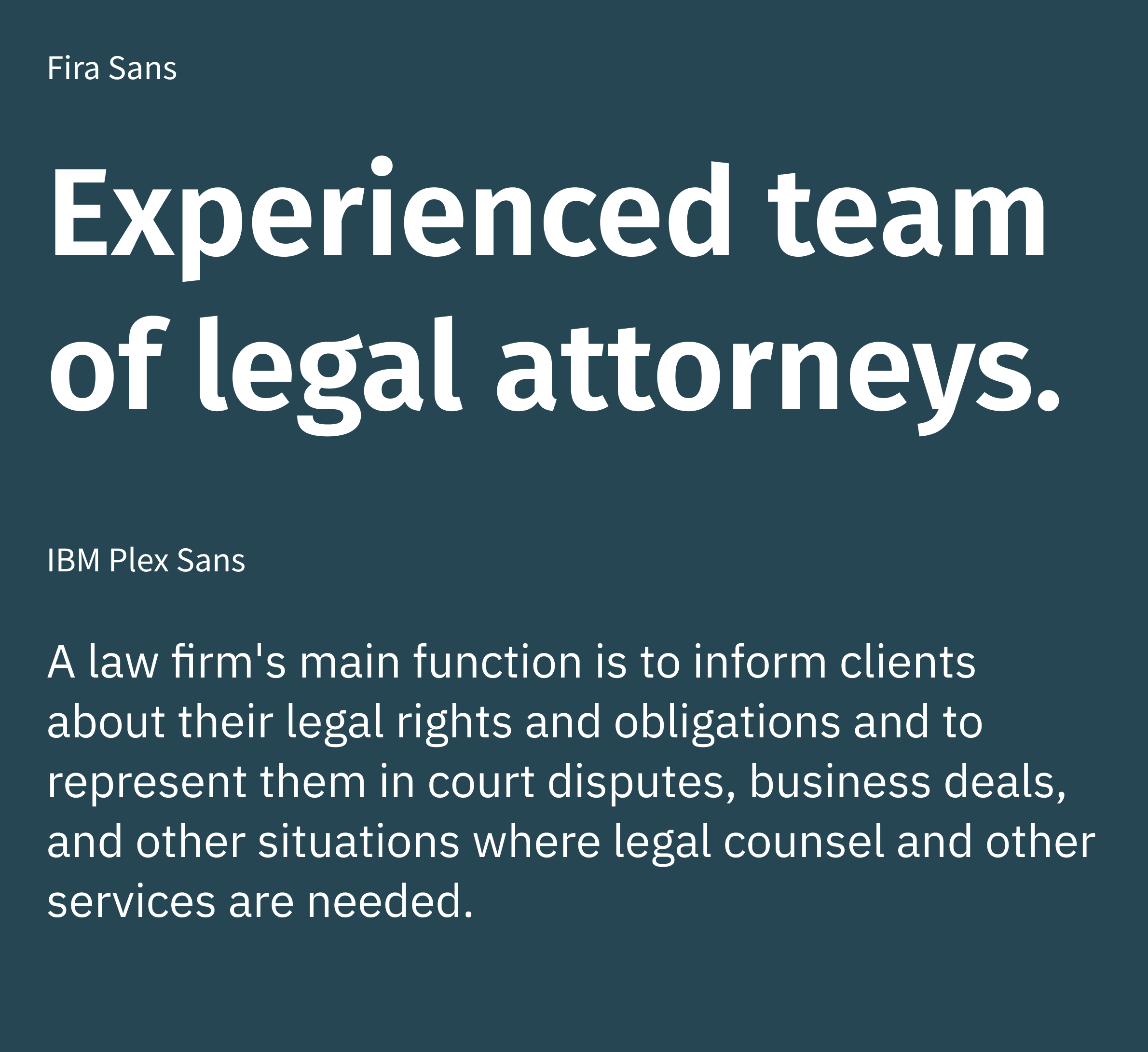
The project began with only a logo and an outdated, cluttered website. I refined the logo, created a new color palette, and built foundational UI components to support the redesign. For typography, I chose Fira Sans for headings and IBM Plex Sans for body text to ensure a clean, modern look.
Primary
Secondary
Neutral dark
Neutral light

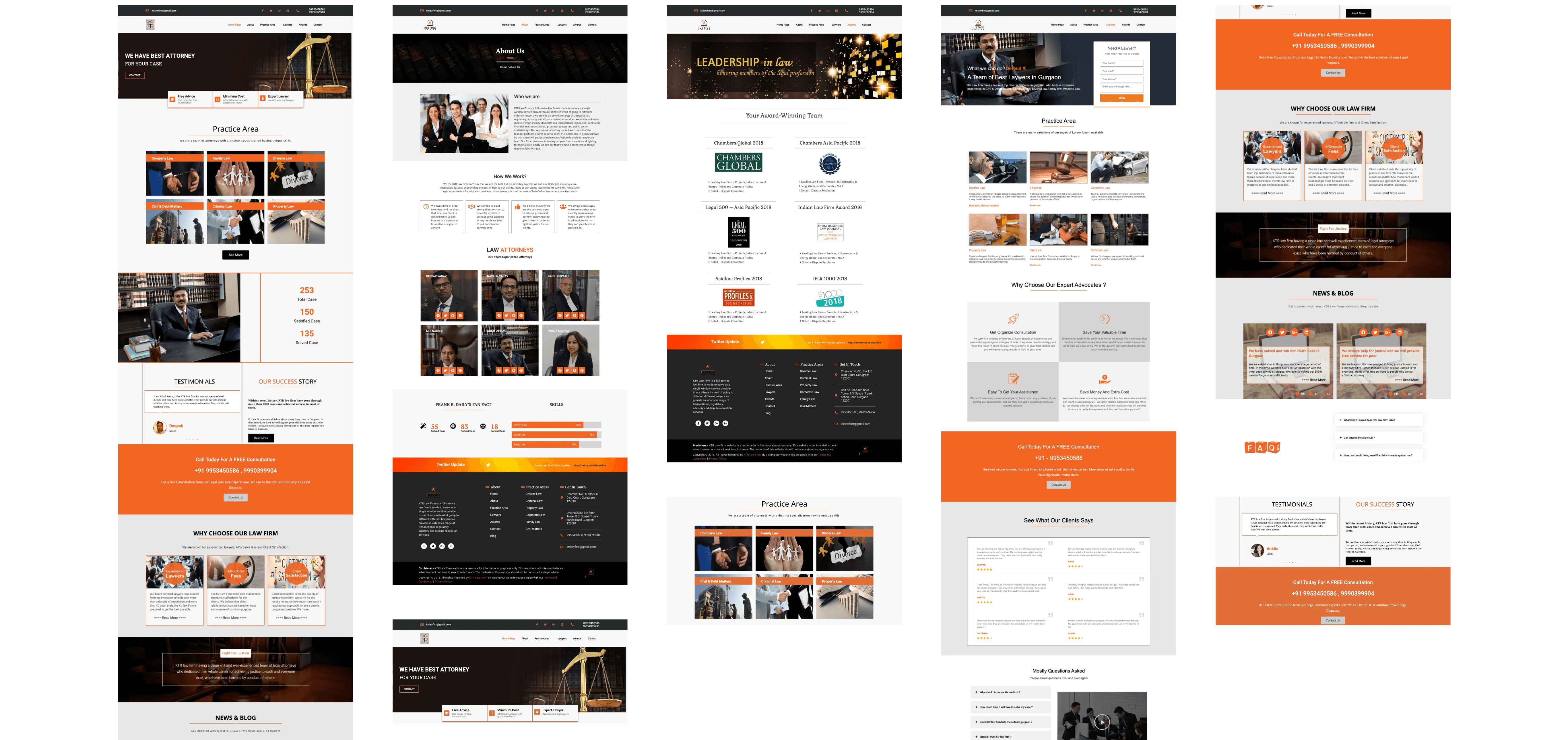
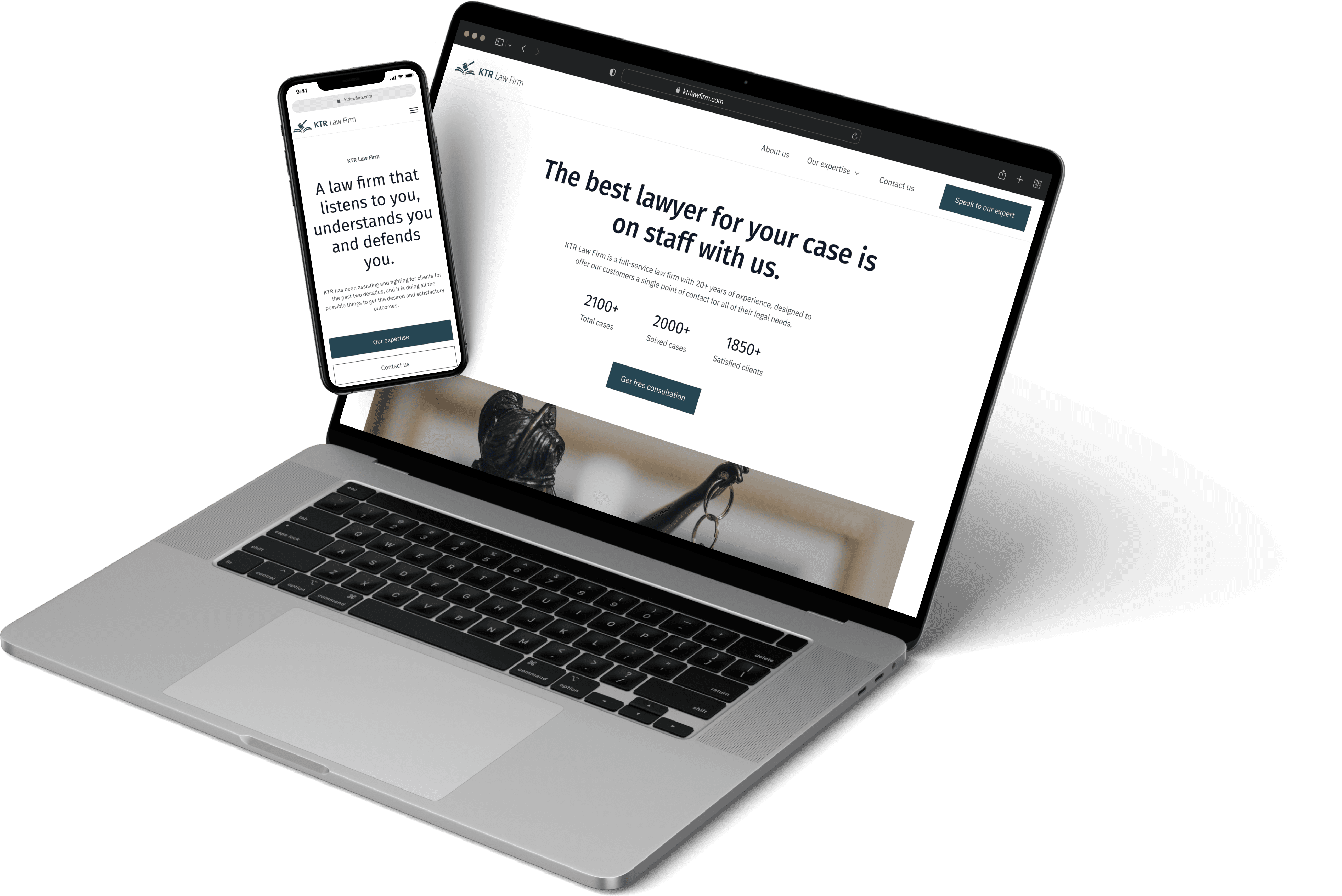
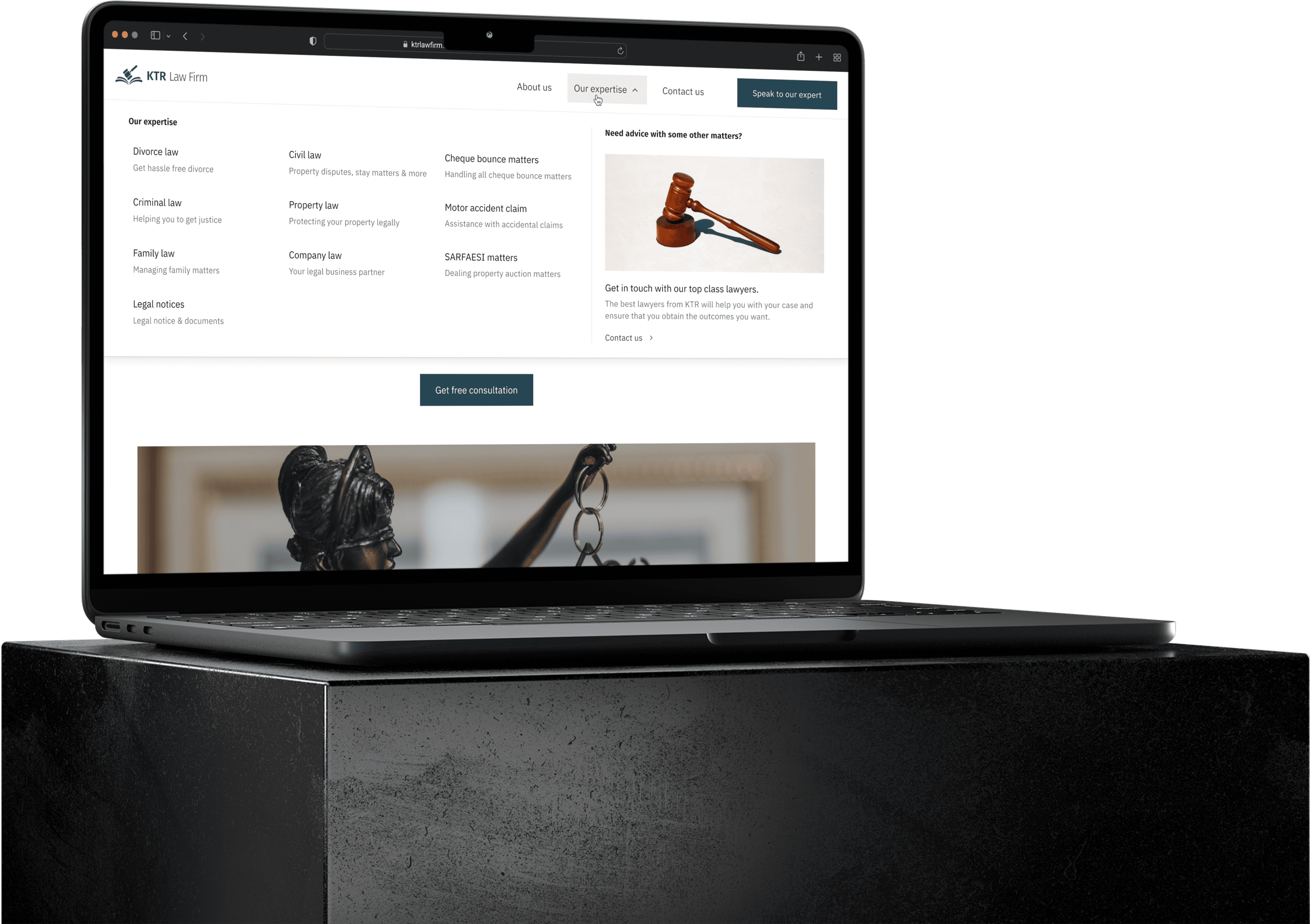
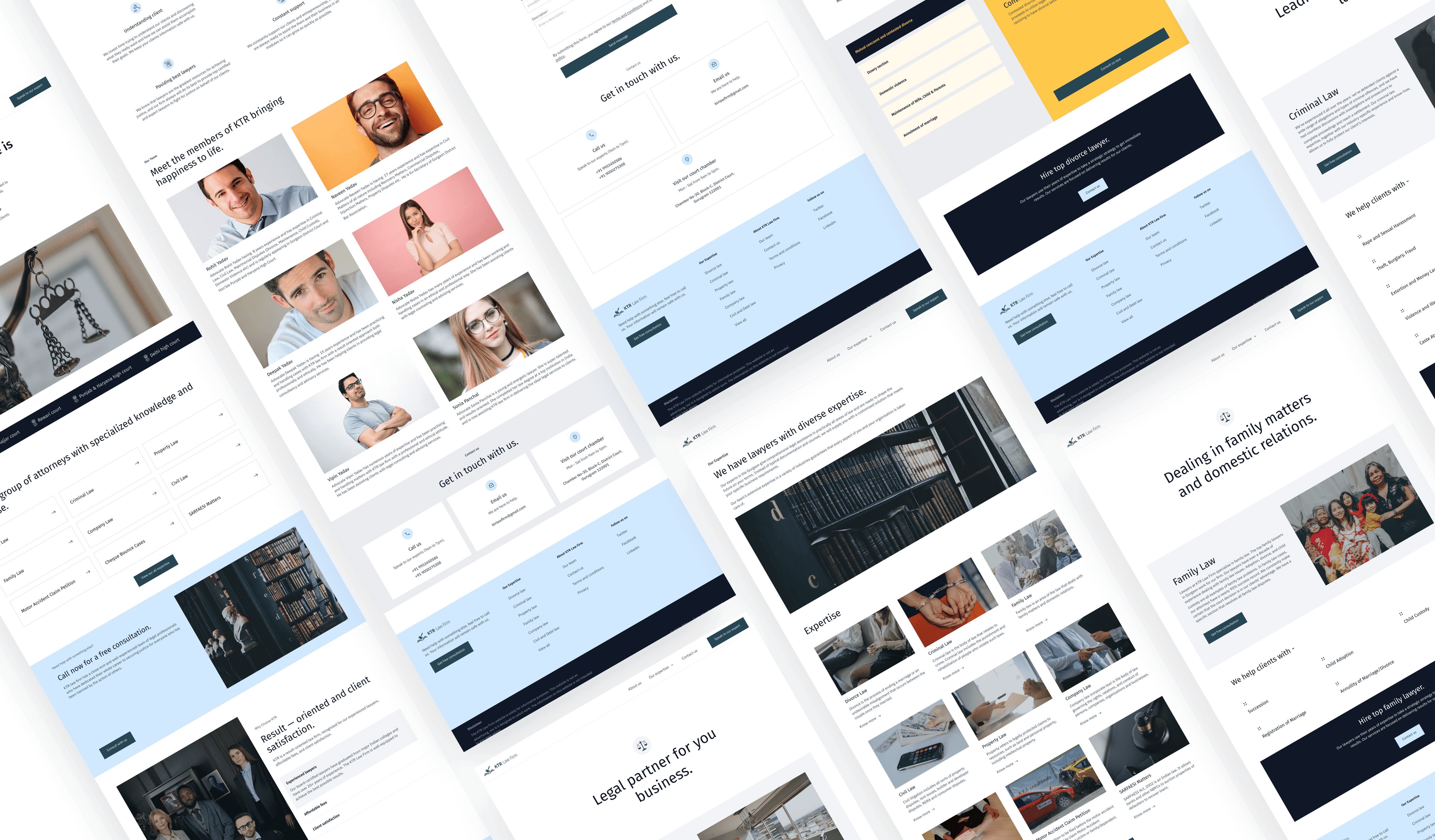
FINAL DESIGNS
Bringing it all together
I designed 40+ screens across the site with continuous feedback from the KTR team. Each iteration helped us align quickly on layout, content, and user flow—resulting in a clean, consistent experience that reflects the brand and meets user needs.


FINAL CONCLUSION & LEARNINGS
After several rounds of iteration and feedback, we finalized a design that feels clear, purposeful, and fully responsive across desktop, tablet, and mobile. The site features accessible navigation and well-placed CTAs that guide users seamlessly to relevant content. Seeing the website go live was incredibly rewarding.
Takeaways
🤝 Executing Design-to-Development Handoffs
As my first freelance project, this was a valuable learning experience in handing off deliverables. I collaborated closely with developers to clarify components and ensure pixel-perfect implementation. A shared style guide helped speed up development and maintain design accuracy.
📝 Practice and Iterations Makes Perfect
At KTR, I learned to improve my designs by gathering feedback through design reviews and stakeholder briefings. Clear communication—especially when asking the right questions—proved essential for overcoming roadblocks and meeting deadlines.
You may also like these projects —

